



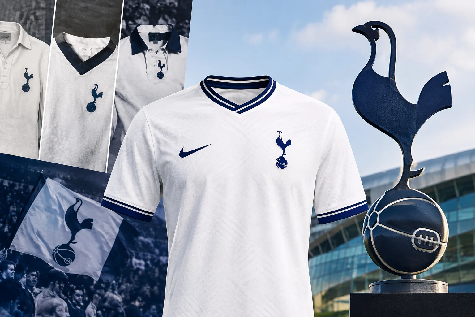
Tottenham have worn white at home since the beginning of the twentieth century, which makes theirs one of the longest unbroken colour associations in English football. A century of the same base colour forces all the design pressure somewhere else.
Where it went is interesting. The collar, the trim and the crest have done all the work, and the result is a kit history with far more variation in it than the colour would suggest.
Why white, and why has it lasted?
The white was adopted in the early 1900s in emulation of Preston North End, then the dominant force in English football and a side who played in white. Copying a successful club’s colours was not unusual at the time, and most such adoptions were abandoned within a decade or two as fortunes changed.
This one stuck, and the reason it stuck is worth noting. White is a difficult colour to wear well and a distinctive one precisely because so few clubs commit to it. Once a club has held it long enough, the scarcity becomes the asset. Changing away from it would have meant surrendering something no amount of redesign could replace.
So the colour became fixed, and everything else became the variable.
What has the navy trim done?
Carried the design, essentially.
Navy is the accent across collars, cuffs, side panels and shorts, and because it sits directly against white it creates the sharpest possible boundary. That contrast is what gives the kit its definition, and it is also why poorly produced versions look wrong so quickly. Any softness at the edge between navy and white reads as a fault immediately.
Across the decades the proportion of navy has varied considerably. Some eras used it sparingly, as a thin collar line and nothing more. Others brought it across the shoulders or down the sides. Those shifts are the clearest way to distinguish one period of tottenham shirts from another, more so than anything happening to the white itself.
How has the cockerel changed?
More than people assume, and it is the single most useful dating tool on the shirt.
The cockerel standing on a ball has been the club’s emblem for over a century, but its rendering has gone through many versions. It has been detailed and simplified, enclosed in a shield and freed from one, rendered in navy, in gold, in white outline. The proportions of the bird itself have shifted, and the ball beneath it has changed size relative to the body.
For anyone trying to place a shirt in an era, the crest version narrows it faster than the sponsor does, because crest changes are less frequent and more visually distinct.
Which collar eras are most recognisable?
Collars are where the personality sits on a white shirt, because there is nothing else competing for attention.
The distinct treatments fall roughly into periods. Long pointed collars belong to one era and are unmistakable. Round necks with a contrasting trim belong to another. Button placket versions appear and disappear. V-necks with navy edging recur in several forms.
A shirt with an unusual collar stays recognisable for decades. A shirt with a plain round neck and no trim is almost impossible to date from the garment alone, which is why those seasons are the ones people argue about.
What makes a season memorable in kit terms?
Three things recur, and they are the same across most clubs.
An unusual sponsor pins a shirt to a narrow window and makes it easy to place. A distinctive collar or trim treatment gives the eye something to hold onto. And a season that people remember for other reasons lends the shirt a significance the garment did not earn on its own.
Shirts with all three become the ones that stay in circulation. Shirts with none of them are perfectly good garments that nobody can identify.
What happened when the white was broken?
Occasionally the club has produced home shirts that interrupt the white with something more substantial than trim, and those seasons stand apart sharply.
Shoulder panels in navy, broad chest bands and pinstripe treatments have all appeared at various points. Because the baseline is so consistent, any of these registers as a significant departure rather than a minor variation, and the shirts from those seasons are among the easiest in the club’s history to identify.
Reaction to them has always been mixed, which is the fate of any departure from a long established identity. What is not in dispute is that they are memorable, and memorable shirts hold interest far longer than conventional ones.
Why is white so demanding to produce?
Because it conceals nothing, which is a design problem rather than only a manufacturing one.
Any variation in fabric weight between panels shows. Any inconsistency in the finish shows. The boundary with the navy trim has to be clean or the whole shirt reads as poorly made. And white ages visibly in a way coloured fabric does not, picking up a grey cast over time if the material is not up to it.
This is the trade the club accepted a century ago. A white kit that is well made looks better than almost anything else on a pitch. A white kit that is not looks worse.
What the identity rests on
The colour has not moved in over a hundred years. The cockerel has been redrawn repeatedly but never replaced. Everything else has been in constant motion.
That is a durable arrangement. The two fixed elements carry the identity, and the collar, trim and sponsor can change every season without threatening it. It is why a Spurs shirt from any decade is instantly placeable as a Spurs shirt even when the details are unfamiliar.
There is a wider lesson in it for reading any club’s kit history. Where a colour is fixed, look at the trim. Where a pattern is fixed, look at its proportions. The element that never moves is the identity, and everything that does move is the dating information. Once you know which is which at a given club, placing a shirt becomes a matter of working through a short list rather than guessing.
Newcastle solved the same problem with a pattern rather than a single colour, and our piece on the black and white stripes through the eras traces it. For a club that built its identity on red and white instead, the Arsenal shirt story covers the parallel.
Frequently asked questions
Why do Tottenham play in white?
The colour was adopted in the early 1900s in emulation of Preston North End, then the leading side in English football. Unlike most such adoptions it was never abandoned, and the length of the association became its own asset.
How can I date a Tottenham shirt?
The crest is the most reliable marker, since the cockerel has been redrawn in several distinct versions over the decades. Sponsor and collar treatment narrow it further within an era.
Has Tottenham ever broken the white home shirt?
Occasionally, with navy shoulder panels, chest bands and pinstripe treatments appearing at various points. Because the baseline is so consistent, any of these registers as a major departure and makes those seasons easy to identify.
Why does navy trim matter so much on a white shirt?
It carries the definition. Navy against white is the sharpest contrast on the kit, so the quality of that boundary determines how the whole shirt reads. Softness at the edge looks like a fault immediately.
About the Author


2 thoughts on “Tottenham Shirts: White, the Cockerel, and What Changes”