


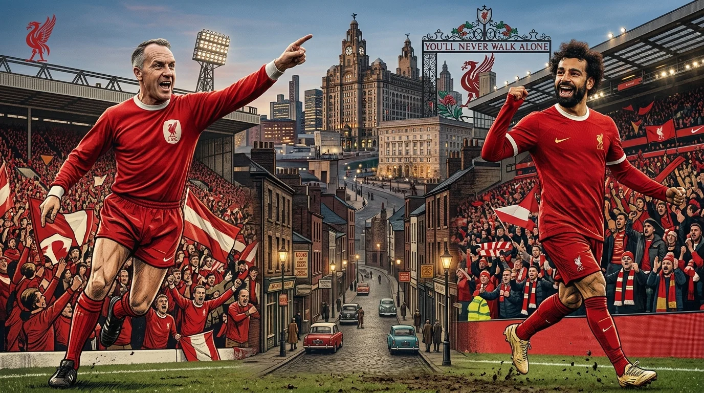
For most of their history Liverpool wore red shirts and white shorts, which was unremarkable. Dozens of clubs did. What happened in the mid 1960s was one of the few genuinely deliberate colour decisions in English football, and it produced a look so complete that it is now difficult to picture the club any other way.
The interesting part is not that the change happened. It is that it was reasoned rather than accidental, which is rare in kit history.
Why did the change happen at all?
Kit decisions at most clubs are reactive. A manufacturer proposes something, a committee approves it, and it lasts until someone proposes something else.
The move to all-red was different in that it came from a specific argument about how a team should appear to the opposition. The reasoning was about visual impact: a solid block of one colour reads as larger and more imposing than a broken silhouette, and eleven players in a single colour look like a unit rather than a collection of individuals.
Whether that psychological effect is real is genuinely debatable. What is not debatable is that it worked as design. The club acquired a visual identity that required no explanation and no crest to be recognisable, which very few clubs manage.
What did the kit look like before?
Red shirts, white shorts, and socks that varied across the decades between red, white and combinations of the two.
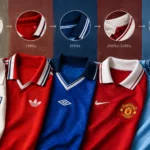
That configuration was standard across English football and it is worth remembering how conventional it was. The shirts themselves were heavy cotton, cut loose, with collars that changed shape by decade rather than by season. A shirt from the 1950s and one from the early 1960s are not easy to tell apart.
This is the backdrop against which the change registered. It was not a tweak to an existing scheme. It removed a colour entirely, and doing that to a kit was unusual.
How did the socks and shorts follow?
The shirt gets the attention but the lower half of the kit did most of the work in making the change feel complete.
Red shorts were the substantive part of the switch, since that is the element that was actually replaced. The socks took longer to settle, moving between red and white with various trim treatments before red became consistent. For several seasons the kit was not quite the uniform block it later became, and shirts from that transitional period are worth knowing about because they sit awkwardly between two identities.
Once all three elements settled, the effect described above became possible. A single colour from collar to ankle reads differently from a single colour interrupted at the waist, and the difference is larger in person than in photographs.
Does the all-red still work the same way?
The visual logic holds, though the context has changed entirely.
When the decision was made, most opponents wore multi-colour kits and a solid block genuinely stood out. Single colour kits are far more common now, which reduces the contrast effect considerably. What remains is the recognisability, and that has if anything strengthened with time.
The other change is television. Colour broadcasting was in its infancy when the switch happened, and a kit designed to look imposing in a stadium turned out to work unusually well on a screen. That was luck rather than foresight, but it mattered a great deal to how the identity spread.
How did the all-red look develop afterwards?
Slowly, and mostly in the details, which is how the strongest kit identities tend to work.
Once the base was fixed, the variation moved to trim. White collar treatments, yellow accents in certain eras, pinstripes in others, and changes in the shade of red itself as manufacturers and dye formulations changed hands. Anyone comparing liverpool football shirts from different decades will notice the red is not constant, and that variation is normal rather than a fault.
The crest has done more work than the colour. It has been simplified, elaborated, had elements added and removed, and moved around the chest. Through all of it the red has stayed, which is exactly what a strong identity allows: everything else can move.
Which eras produced the most distinctive shirts?
Three factors tend to separate the shirts people still recognise from the ones that blur together.
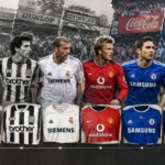
Collar treatment is the first, because collars change more than any other element and a distinctive one dates a shirt instantly. The second is sponsorship, since deals run in multi year blocks and an unusual or short lived sponsor pins a shirt to a narrow window. The third is the manufacturer, whose house style shows through in the cut, the trim and the way the crest is applied.
Shirts that combine an unusual collar with a short sponsorship run are the ones that stay recognisable decades later. Shirts from long sponsorship periods with conventional collars are difficult to date even for people who follow the club closely.
Did the change influence other clubs?
Several clubs moved towards single colour kits in the following decades, though attributing that directly to one decision is generous.
What is clearer is that all-red, all-white and all-blue configurations became more common across European football through the 1970s and 1980s, and that the visual logic behind them was broadly the one described above. A single colour reads as a unit. It photographs well. It works on television, which was becoming the medium through which most people saw football.
That last point matters more than it sounds. Kit design from the 1970s onwards was increasingly made for a camera rather than for a stand, and solid colours survived that transition better than complex patterns did.
How do you date a Liverpool shirt?
Start with the sponsor, which narrows things to a block of years immediately. Then the manufacturer’s mark, which changes on its own cycle and frequently does not align with the sponsorship blocks, giving you a useful cross reference.
Then the collar, which is the element that varies most within a given sponsorship period. Then the crest, which has gone through several distinct versions and is the most reliable marker for the broad era.
Shirts that are difficult to place usually come from long stable periods where all four of those were unchanged for several seasons. That is not a flaw in the shirt, but it does mean the season has to come from the listing rather than from the garment.
What the all-red actually achieved
It gave the club a visual identity that does not depend on any of the elements that change. Sponsors come and go, manufacturers rotate, crests get redrawn, collars follow whatever the decade is doing. The red survives all of it.
Very few clubs have that. Most rely on a combination of colour and pattern, and when the pattern changes the identity wobbles. A single colour cannot wobble. That is the whole strength of it, and it is why a decision made in the 1960s still defines how the club looks.
Tottenham arrived at something similar from the opposite direction, and our piece on the white shirt and the cockerel traces how. For where these shirts sit against the rest of the league, Premier League jerseys ranked by popularity puts numbers to it.
Frequently asked questions
When did Liverpool start playing in all red?
The mid 1960s, replacing the red shirts and white shorts the club had worn for decades. It was a deliberate decision about visual impact rather than a routine kit refresh.
Has the shade of Liverpool’s red changed?
Yes, across the decades, as manufacturers and dye formulations changed. Variation between eras is normal, and shirts from different periods do not match exactly when placed side by side.
How can I tell which season a Liverpool shirt is from?
Work through the sponsor first, then the manufacturer’s mark, then the collar treatment, then the crest version. The sponsor narrows it to a block of years and the collar usually separates seasons within it.
About the Author

1 thought on “Liverpool Football Shirts: The Decision That Made Them All-Red”